
Paint is more than a finishing touch—it’s a powerful design tool that can shape the mood, function, and visual impact of every room in your home.
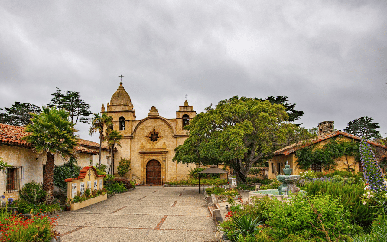
In Carmel, where homes often blend coastal elegance with natural surroundings, color plays a crucial role in tying architecture and interior style together. If you're preparing a home for sale or simply want to refresh your space, understanding the science behind color can help you make confident, strategic choices.
Why Color Matters in Home Design
Paint sets the tone for every interaction in your home. Color can influence how large or small a room feels, how light is perceived, and even how long someone wants to linger in a space.
In the Carmel market, where natural light, architectural details, and coastal views often guide design, selecting paint tones with intention can enhance these elements without overpowering them.
Before you pick up a paintbrush, let’s explore how color works—and how to use it to your advantage in every room.
Understanding Color Psychology
The way color affects us isn’t just emotional—it’s physiological. Our brains process different hues in ways that alter energy levels, focus, and even appetite. That’s why the science of color is such a valuable design tool.
Here’s a brief look at the general effect of common color families:
- Blues: Calm, serene, and clean—ideal for bedrooms and bathrooms.
- Greens: Restful and restorative, with a strong link to nature.
- Yellows: Uplifting and energizing, especially in small doses.
- Grays: Sophisticated and versatile, perfect as a neutral base.
- Neutrals (beige, cream, off-white): Warm and inviting, great for open-plan living.
- Whites: Clean and airy—best used where light is plentiful.
- Darker tones (charcoal, navy, deep green): Add drama and depth to accent walls or enclosed spaces.
Best Paint Tones by Room
Choosing the right color for each space is part art, part science. Let’s break it down room by room, keeping in mind Carmel’s signature blend of indoor comfort and coastal charm.
Living Room
This is where people gather, relax, and connect. A balanced palette is key—something that complements natural light and makes the space feel both welcoming and elevated.
Recommended tones:
- Soft taupe or warm beige for versatility
- Pale olive or sage green for a subtle organic feel
- Off-white with warm undertones to enhance natural textures
Kitchen
In a space defined by energy and movement, color can either soothe or stimulate. Neutrals with a touch of warmth keep things timeless and inviting.
Best options:
- Soft beige or mushroom
- Muted blue-gray
- Creamy white cabinetry with matte black or brushed metal accents
Dining Room
This is one of the few rooms where you can go a little bolder. Richer tones can make dining feel more intimate and luxurious.
Go for:
- Deep navy or muted teal
- Burnt terracotta or wine-inspired burgundy
- Matte charcoal for a moody, elegant backdrop
Bedroom
Restful, restorative tones are the goal. Stick to cool or muted hues that encourage relaxation without making the space feel too dark.
Top choices:
- Soft blue-gray or pale green
- Warm gray or lavender-gray
- Cream or sand tones for a coastal feel
Bathroom
Bathrooms benefit from clean, fresh tones that reflect light and enhance a sense of cleanliness and calm.
Consider:
- Light aqua or seafoam green
- Crisp white or dove gray
- Warm beige or ivory for a spa-like vibe
Office or Study
A home office needs a color that promotes focus and productivity without overstimulating.
Effective tones include:
- Dusty blue or green
- Muted browns or earthy clay
- Warm neutrals with subtle contrast
Lighting Considerations in Carmel Homes
In coastal regions like Carmel, natural light plays a significant role in how paint appears. The same color can look vastly different depending on the time of day, wall orientation, and window placement.
Tips for working with natural light:
- North-facing rooms: Tend to have cooler light—use warmer tones to balance.
- South-facing rooms: Bright and warm—neutrals and cooler colors work well.
- East-facing rooms: Morning light is soft and warm—choose calming tones.
- West-facing rooms: Afternoon light is golden—test colors to avoid a yellow cast.
Don’t Forget About Finish
Finish impacts both appearance and durability. In high-end homes, the goal is a refined, polished look without unnecessary shine.
Here’s a quick guide:
- Matte: Best for walls with imperfections; soft and understated.
- Eggshell: Slight sheen, good for living spaces.
- Satin: More durable, ideal for kitchens and bathrooms.
- Semi-gloss: Used for trim, baseboards, and cabinetry.
- Gloss: Rare in residential settings—can feel harsh in large areas.
Contact Katy Harrison
Whether you’re refreshing your home for sale or redesigning to reflect your personal style, Katy Harrison understands how thoughtful color selection can transform a property. Based in Carmel, she knows how local lighting, coastal conditions, and architectural features influence the way paint reads in every room.
Katy works closely with clients to guide smart design decisions that balance style with value. Her experience in staging, design trends, and buyer psychology makes her the ideal partner for those looking to make impactful home updates.
Reach out to Katy Harrison today to learn how strategic color choices can elevate your home’s appeal and maximize its potential in the Carmel market.